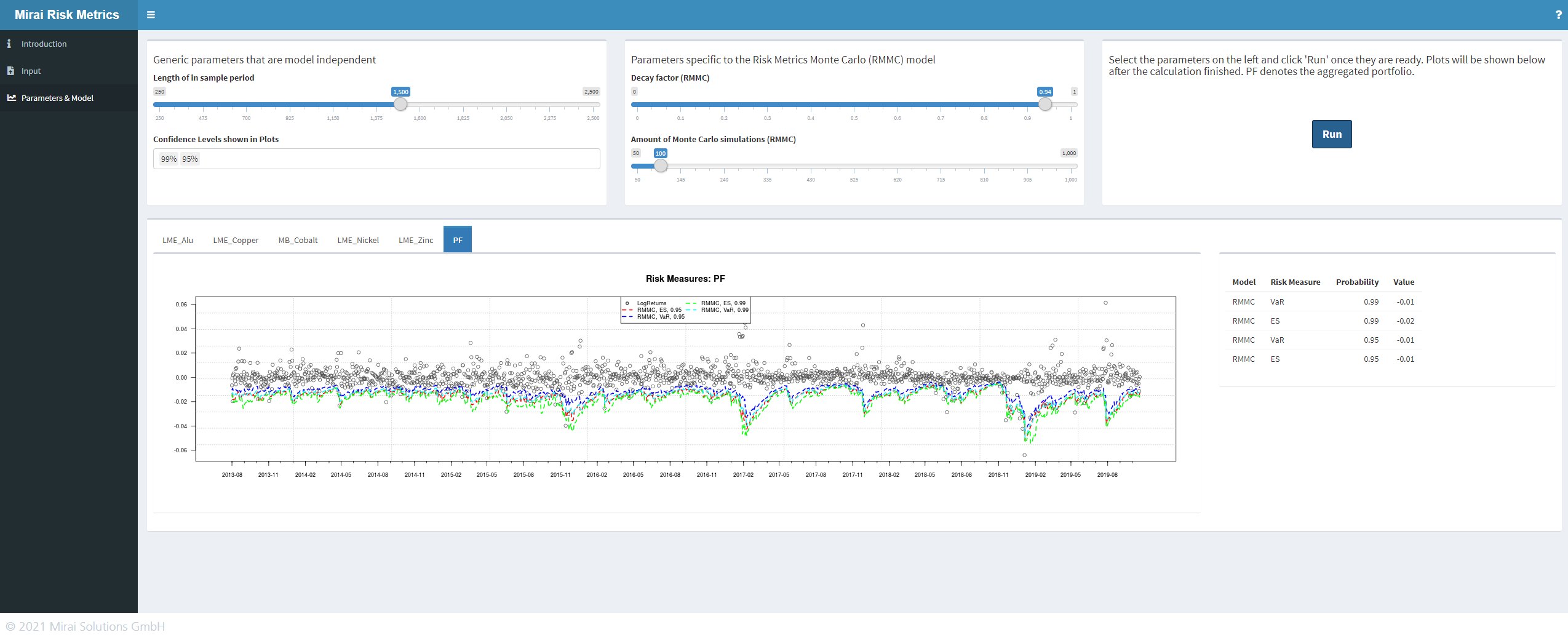
Do you want your users to engage with your shiny app?
Here some UI principles that you should apply to your shiny app to make it more user friendly.

First of all, what is UI and why care about it? User Interface (UI) design - or engineering - aims to maximize usability and User Experience (UX). UI Design focus on developing the aesthetics, making the experience pleasant and intuitive, while UX is more associated to user interactions. You will need to pay attention to both of them, while developing your app - since they play a critical role in building a business success.
The user is a king and de facto is always right. At least that is what a performing UI/UX needs to assume.
The look and feel of your app is very strategic and it will influence the user engagement. A well-designed UI increases the user satisfaction dramatically. It goes without saying that a happy user will use the app more and will talk positively about it, even potentially bringing new users to try it.
You’re not alone, don’t forget that our digital word is a jungle where a continuous competition occurs to get the user’s attention for a moment. A user-friendly and appealing UI can make the difference, grab the attention of a user and encourage him to stick around with YOUR shiny app.
Follow these core principles:
1. Clarity
The users usually do not have the time and the wiliness to spend time figuring out how things work. They expect an intuitive and positive experience from scratch. So keep it simple, follow standards and mirror language and concept of the real world.
2. Flexibility
UIs which allow user customization and tailoring are likely to engage the user more. A user will feel attracted if he is able to interact with your shiny app and get insights on things he is really interested in. Allow the users to make mistakes and enable them to undo, redo and cancel their actions, practically allowing the users to perform what they truly desire.
3. Accessibility
A UI is accessible when most of the users can interact it in a easy way, which includes people with disabilities. At least make sure that the users you are targeting will have easy access. Be nice with your future users and think how to minimize his effort. Let him click less to reach what he is looking for. Help him to recognize things instead of having to recall them. Prevent him making errors.
4. Consistency
Use the same patterns and concepts along your screens. Be consistent with the common rules and behavior. Make the user feel at home and meet his expectations.
5. Purpose
The UI should make obvious the purpose of the app and how the user will benefit on using it. Add a nice storytelling with great visuals to your UI and you will see the user excitement grow.
6. Communication
Provide feedback to your user. Let him know clearly his location and what to expect. Give hints on the status of his actions. If an error occurs, help your user out. Ease access to a concise documentation if required.
To wrap up
Make sure look after these points in your shiny app:
- usability
- structure
- interaction
- visual design
For a quick recall of the 10 Usability heuristics for User Interface Design, have a look at our infographic.
Download infographic

